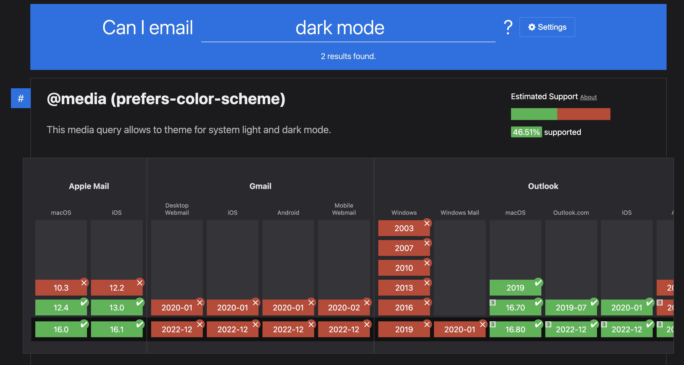
The support for dark mode override styles in email clients is limited to Apple Mail on iOS/MacOS; which means dark mode overrides will not work on any other clients like Gmail, Outlook etc. Please be aware of this and try to design your emails with the progressive enhancement in mind.
 Video Tutorial: Add dark mode styles to HTML email designs
This video tutorial is a complete step-by-step guide showing you how to add custom dark mode style overrides to your email designs for exporting production-ready, responsive HTML emails from Figma using the Emailify plugin.
Important design considerations for dark mode

The support for dark mode override styles in email clients is limited to Apple Mail on iOS/MacOS; which means dark mode overrides will not work on any other clients like Gmail, Outlook etc. Please be aware of this and try to design your emails with the progressive enhancement in mind.
Due to each email client having their own implementation, dark mode is very tricky to design for, but it's worth trying to work with the (often terrible) changes that each email client automatically applies in dark mode.
It's a good idea to check out some resources (like these articles from CampaignMonitor and Litmus) that go through exactly what these email clients are changing and how to mitigate some of those changes in the design as good starting points.
Applying dark mode text color and background color overrides
You can click on elements like text, images, buttons, sections and columns, then click on the Settings button in the plugin header to specify dark mode text color and background color overrides for your elements at the bottom of the Settings panel, which will be shown on the email clients that support this feature (iOS/MacOS Apple Mail apps) when the email is being viewed on a device with dark mode enabled.
The support for dark mode override styles in email clients is limited to Apple Mail on iOS/MacOS; which means dark mode overrides will not work on any other clients like Gmail, Outlook etc. Please be aware of this and try to design your emails with the progressive enhancement in mind.
Swapping between two image layers in dark and light mode
You can also swap certain image layers to swap them out on dark mode by clicking on your Figma content layer (inside of a Column layer), then clicking on the Settings button in the plugin header, and enabling either the Only Hide in Dark Mode or Only Show in Dark Mode toggle depending on if you want the image layer to be shown or hidden on the email clients that support this feature (iOS/MacOS Apple Mail apps) when the email is being viewed on a device with dark mode enabled.
The support for dark mode override styles in email clients is limited to Apple Mail on iOS/MacOS; which means dark mode overrides will not work on any other clients like Gmail, Outlook etc. Please be aware of this and try to design your emails with the progressive enhancement in mind.
Previewing dark mode in the plugin
You can preview your dark mode overrides using the Dark Mode toggle in the preview feature in the plugin.
Enabling the Dark Mode toggle in the plugin's preview panel will also allow you to see an approximate visual of what your design will look like when it's viewed on a device with dark mode enabled by emulating some of the changes that they apply.
This preview mode will also allow you to easily see any of the background color, text color or dark/light image swaps that you've added in the Emailify dark mode override settings.
To accurately see what your design looks like in email clients that support dark mode overrides (Apple Mail on iOS/MacOS), it's always worth doing a test of your own emails using a service like Litmus or Email on Acid, just to ensure they're looking good before you send them out.
The support for dark mode override styles in email clients is limited to Apple Mail on iOS/MacOS; which means dark mode overrides will not work on any other clients like Gmail, Outlook etc. Please be aware of this and try to design your emails with the progressive enhancement in mind.
Please note that different email clients (that have dark mode support) will apply their own dark mode overrides automatically to invert and update colors to try and maximize readability and contrast, so it's always worth doing a test of your own emails using a service like Litmus or Email on Acid to accurately see how they're rendered in all email clients in dark mode.
It's also worth using some other clever design techniques for creating your email with dark mode in mind as a fallback with other email clients, too.
Testing your emails in dark mode
 Video Tutorial: Test HTML emails in dark mode with exports from Figma
This video tutorial is a complete step-by-step guide showing you how to test HTML emails in dark mode with exports from Figma using the Emailify plugin and Litmus.com.
It's always worth doing a test of your own emails using a service like Litmus or Email on Acid to ensure they're looking good before you send them out.
The support for dark mode override styles in email clients is limited to Apple Mail on iOS/MacOS; which means dark mode overrides will not work on any other clients like Gmail, Outlook etc. Please be aware of this and try to design your emails with the progressive enhancement in mind.
You can apply settings in bulk by opening Settings, then selecting multiple Emailify layers of the same type in Figma. Any setting you change will be applied to all selected layers.